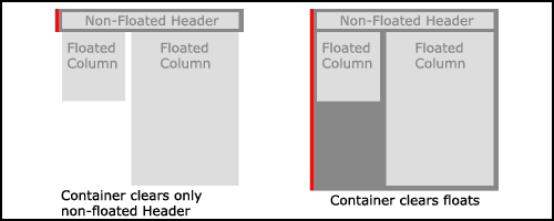
A container DIV which contains only floated elements will collapse unless something forces it to clear the floated elements. This is a situation you often run into when creating layout columns. Below, left, is a graphic example of a container DIV (dark gray) that does not clear the floated elements nested within it. On the right is a container DIV that has been forced to clear the floated elements. This page presents several Clearing Methods which will help deal with this problem when it comes up.
If a container DIV has been styled with a border or a background image (as we will be doing shortly), it becomes even more apparent that something is wrong with the left example. Here is a nice online
Example
 page courtesy of SitePoint which interactively demonstrates the float clearing problem.
Why doesn't the container DIV automatically wrap around the floated elements the way it does with other nested elements?
When you apply the float property (as well as the position property) to an element, you take it out of the 'normal flow' of the document and put it into a 'pseudo-layer'. Since the container DIV is in the 'normal flow' of the document it only wraps around nested elements that are also in the normal flow, such as the header in the example above, left. If we were to also float the container DIV, it would then be in the same 'pseudo-layer' as the floated elements and would, then, wrap around them. This is what we did with the horizontal navigation bar in last week's lecture. But floating the container DIV is not always practical or desirable.
The clear property is the most straightforward way to solve the issue. If a nested element follows the floated items within the container DIV's markup, and if that element is in the 'normal flow,' it can be styled with the clear property to ensure that it is moved down the page past the floated elements. The container DIV then recognizes that it must encompass this last nested element (which is in the 'normal flow') and the container will stretch to surround it. A footer element often serves this purpose when dealing with floated columns.
However, including another nested and visible element following the floated items - such as a footer - does not always fit with the page design. As we will see later in this lecture, there are circumstances that call for a non-visible clearing method. Presented below are several methods for forcing the container DIV to surround its floated contents.
Here is the markup on which the following discussions are based:
HTML Markup
<!-- begin contentArea -->

<div id="contentArea">
  <div id="column1">First floated column</div>
  <div id="column2">Second floated column</div>
  <div id="column3">Third floated column</div>
</div>

<!-- end contentArea -->
Clear DIV Method
In a previous lecture on
Three-Column Float with Header/Footer
 ,
I suggested using an extra DIV in the markup following the floated columns.
This extra DIV, which contains only a non-breaking space or an HTML comment, is then styled with
,
I suggested using an extra DIV in the markup following the floated columns.
This extra DIV, which contains only a non-breaking space or an HTML comment, is then styled with clear:both. Though simple, this method does add unnecessary markup to your HTML document, and that extra markup is associated with presentational display. This is frowned upon by CSS purists.
Style Sheet
div.clearFloats { clear: both; }
HTML Markup
<!-- begin contentArea -->

<div id="contentArea">

  <div id="column1">First floated column</div>
  <div id="column2">Second floated column</div>
  <div id="column3">Third floated column</div>

  <div class="clearFloats">
    <!-- this comment is in the non-floated element -->
  </div>

</div>

<!-- end contentArea -->
Overflow Method
In another recent lecture we discussed
Content Overflow
.
It turns out that using the overflow property can also fix the clearing issue!
Here is the code:
Style Sheet
div#contentArea  {
  width: 100%;
  overflow: hidden;
  }
HTML Markup
<!-- begin contentArea -->

<div id="contentArea">
  <div id="column1">First floated column</div>
  <div id="column2">Second floated column</div>
  <div id="column3">Third floated column</div>
</div>

<!-- end contentArea -->
overflow:hidden.For IE6 and below you must add a width property to the container DIV. This can be 100% if your design is full screen width. You may have already specified a different width for the container DIV if it takes up less than the full screen width so this is usually not a problem. Check out SitePoint's
Example
of using the Overflow Method (the actual value used on the Example page is overflow:hidden).
overflow:auto although this will produce scrollbars in IE Mac.Of course when using this method is it imperative that you carefully calculate the total width of all the nested and floated elements so that they do not exceed the width specified for the container DIV. When using overflow:hidden anything wider than the specified container DIV width will be... well, ...hidden!
The Aslett Method
If by chance you run into the unlikely situation where the Overflow Method causes problems, the Aslett Method will provide an alternative, all-CSS method for getting the job done. The Aslett Method makes use of the infrequently used pseudo:after class to append a single "block level" period character after the floated elements. It uses a clear:both declaration which forces the container to stretch down to enclose its nested content (the period). The period character is hidden by using visibility:hidden, and height:0 is used to ensure that it takes up no vertical screen space. This technique is the CSS equivalent of the "Clear DIV Method" described above and works well in standards-compliant browsers. Not unexpectedly, a hack and several extra lines of additional CSS are required for various versions of IE, both Win and Mac.
Style Sheet
div#contentArea:after {
  content:".";
  display:block;
  height:0;
  clear:both;
  visibility:hidden;
  }

  /* rules needed by IE: */

div#contentArea {
  display:inline-block;
  _height: 1%;
  }

  /* Hide from IE Mac \*/
div#contentArea {display:block;}
  /* End hide from IE Mac */
HTML Markup
<!-- begin contentArea -->

<div id="contentArea"">
  <div id="column1">First floated column</div>
  <div id="column2">Second floated column</div>
  <div id="column3">Third floated column</div>
</div>

<!-- end contentArea -->
If you happen to come across other variations of the Aslett Method online, check carefully to be sure the height:1% declaration is preceded by an underscore. This "1%" rule targets IE5.0. The older version of the Aslett Method without the underscore causes problems with IE7. Naturally, if any of the IE-specific instructions are allowed to fail, it should be those targeting the oldest browser version, not the newest.
Now we are ready to apply a clearing method as we move into the topic of Faux Columns.
Resources:
- QuirksMode -
Clearing Floats
- Ed Eliot's weblog - Methods for Containing Floats
- Contained Floats by Tony Aslett