
View the forum for updates and announcements. View my blog for the same!
For the most part, the grades for homework 6 were very good. If I reduced your grade substantially I offered feedback as to how you might fix the assignment, and I typically allowed you to to re-submit the assignment to raise the grade.
The comments in this document address a number of issues that I observed when grading the assignment. The commentary here is meant to re-enforce the concepts and perceptions in the lecture materials.
Document #1 - Practice with Images and Float
This document was not difficult and most of you received full credit. For those that did not follow the instructions and inserted or floated an image when it was not called for, then you probably had your score for this document reduced.
Document #2 - Pre-layout with Float - When do you clear floats?
I display two different approaches for dealing with floats in this document, and the submissions were split about 50% using one or the other techniques.
Now neither of these approaches is right or wrong. I just want to emphasize the difference between the approaches so that you understand the implications of changing the window-width when you use floats, and possibly clearing floats.
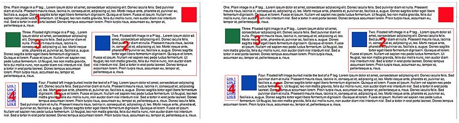
The example below shows a submission which cleared the 4th paragraph. The image on the left looks almost exactly like the example in the instruction handout.
But note how that same page looks when the window is widened (right image). Because the fourth paragraph is cleared, the text in the fourth and fifth paragraphs will always be displayed below the 2nd and 3rd paragraphs. The larger the window-width, the more space there will be between the paragraphs above and those that are cleared and displayed below.
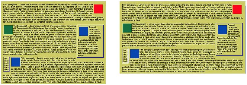
The second technique does not clear the 4th paragraph. The image below and on the left displays the page almost exactly as does the homework instructions.
The right-side image shows that when the window is widened, the 4th and 5th paragraphs move up to wrap around the floated elements above, because nothing was cleared.
What is the point here?
Either technique is acceptable, but developers need to view their pages at different window-sizes and screen resolutions to observe how their clients may see their pages... this point is expanded upon below in the slideshow comments!
Document #2 - Pre-layout with Float - Numbering the Paragraphs
Numbering the paragraphs was an optional challenge and about 1/3 of you did include numbers.
Here was one approach with styles and markup of:
p#one   { position: absolute; top: 125px;  left: 300px;  z-index: 100; }
p#two   { position: absolute; top: 80px;   left: 700px;  z-index: 200; }
p#three { position: absolute; top: 80px;   left: 300px;  z-index: 300; }
p#four  { position: absolute; top: 275px;  left: 25px;   z-index: 400; }
p#five  { position: absolute; top: 300px;  left: 300px;  z-index: 500; }
The problem with this set of styles is that all of the paragraphs are being absolutely positioned... but, to what. Well that would be to their containing element, and the body in this case.
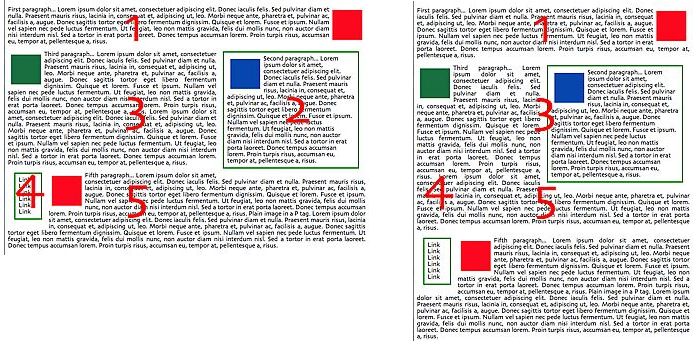
In the image below on the left side, the numbers display perfectly.
The image below-right shows what happens if the window is narrowed. The numbers are absolutely positioned to its containing block which is the body, which means the main viewport. If the window is re-sized, the text in other paragraphs re-wrap to the new window width, but those five numbered paragraphs remain where they are... the numbers only look correct if the window is set to "the perfect width":
A more efficient and elegant solution!
I must say that I am sooooo impressed that most of you came up with the proper solution so that the numbers were absolutely positioned relative to the nearest containing block. There were multiple solutions based upon this principle:
The first, second, third, etc., paragraphs should be set to a position of relative, and the numbers embedded inside a paragraph should be set to a position of absolute. The numbers are then positioned in an absolute manner but relative to their nearest containing block... the paragraph that the number exists within. And I am simplifying this code, but you should get the drift:
/* Styles */
p { position: relative; }

#num1 {
   position: absolute:
   top:  10%;
   left: 25%;
   }

<-- markup -->
<p class="justified"><span id="num1"">1</span>The first paragraph.</p>
If the window is re-sized using this method, the embedded numbers re-position themselves relative to their containing block and look appropriate regardless of the window-width.
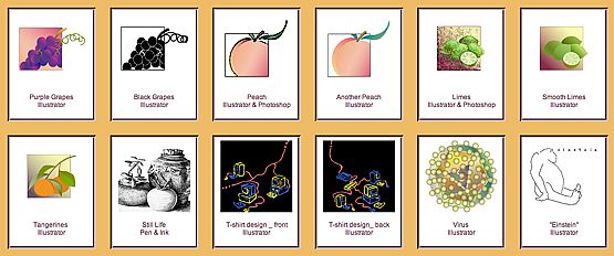
Document #3 - Photo Gallery, Window-width and line-breaks re-visited!
As I viewed this document it was evident that a number of you have very large monitors... which is great, and I do to. But it did point out issues related to the window-width and the use of line-breaks to specify how many images fit on any one row in YOUR photo gallery.
Here is a screenshot of the lecture page which describes how to force a line-break when designing a grid of images:
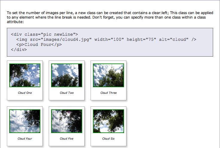
It is important to understand the graphic impact from this lecture example - The images display properly with 3 images per row with any window-width because the images are only 100 pixels in width. Three images of this size will display the grid properly whether viewing the page at 800x600, 1024x768 or larger.
But what happens if the images are wider and there are many more images on a row?
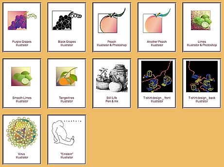
Here is an example of a gallery of beautiful images with the grid set up for 6 images per row. The seventh image has a line-break per the lecture document instructions. Now this gallery looks great if the window is wide enough to display 6 images per row. A monitor resolution of 1280x1024 is required with the window maximized to obtain the intended design effect.
What if the window is narrowed to 1024x768?
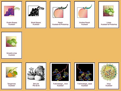
As you can see in the image above, the window is no longer wide enough to display 6 images per row and thus one image must wrap to an individual line. And because the 7th image has a line-break, the third row starts a "real" new row... not the intended design effect!
What are the point(s) I am trying to make here?
Line-breaks per the lecture materials are reasonable to use. HOWEVER, it is the developer's responsibility to view their pages at different window widths to ensure that their assumed design translates to what the client actually sees! We cannot assume that what we see on our high-powered development hardware is what our client's will also be using!
Line-breaks are reasonable when the material is narrower than a standard-sized monitor... either 800x600 or 1024x768. But when the content is wide, we must test to ensure that everyone sees the same thing that we do.
Many PC users typically have all of their application windows maximized. Do not fall into this trap! Mac and UNIX users, as well as many PC users, do not maximize their windows. Viewing a page at varying window widths is a required part of the process for a web developer!
The problem experienced in the example above can be solved by NOT including hard line-breaks! If no line-breaks are used, then each image automatically will wrap to accordingly to fill the page, as in the example below, which looks very attractive and reasonable:
I guess the point is - there are no iron-clad and hard-and-fast rules... every situation requires a solution for the specific page being displayed. And testing with various window-widths in just a part of the process for a web developer :-)