In keeping with the visual orientation of CSS, this Box Model summary page recognizes that a picture is worth a thousand words. Below I have included two graphic representations of the Box Model, and then finish with a recap of the box model rule.
The first illustration is
Jon Hicks'
 elegant 3D box model which shows how the various elements of The Box are stacked on top of one another.
The second diagram is from Eric Meyer's book. It illustrates all of the parts which come into play when considering the "size" of an element box... not just the visible portion of the box.
Jon Hicks' 3D Box Model Illustration
On Jon Hicks' web page he says:
The clarity of the illustration speaks for itself.

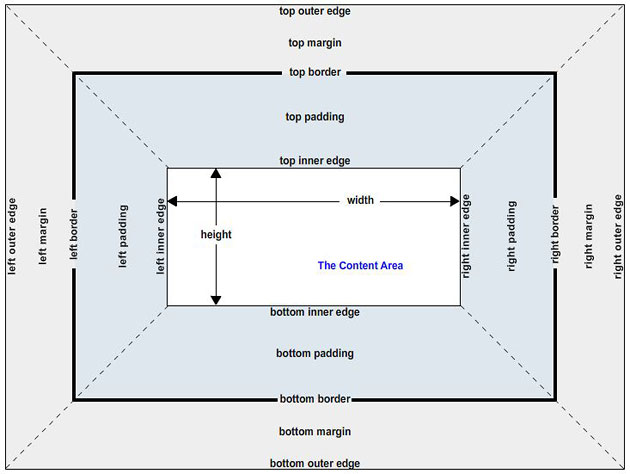
Eric Meyer's Diagram
The total size of an element box is illustrated from the left outer edge to the
right outer edge. Included are the content area (which responds to the width property), padding, borders and margins. (Of course vertical elements are also included in the total size of an element box but are not of particular interest in this lecture. Vertical expansion of HTML elements is generally very graceful.)
The visible portion of a box includes only the content area, padding and borders.
A Simple Rule From Eric Meyer
In many of the examples in this lecture we have given our element box a specific
content width. In fact, the majority of the time we would not provide specific content
widths for nested element boxes such as paragraphs. Generally we only set the width property
when a box is being used as a 'container.' The following quote from Eric Meyer's book,
CSS: The Definitive Guide, states that the containing block has a specified content
width but that the nested boxes within it do not and will; therefore, automatically
expand to fit the containing block's content area.
width property of the parent.
Take two paragraphs within a div whose margins are set to
1em. The content
width (the width property) of the paragraph, plus its left and right padding,
borders, and margins always add up to the width property of the
parent div's content area.
Let's say the
width property of the DIV is 40em, which then
makes the sum total of the content width, padding, borders, and margins of each paragraph
equal to that 40em. This paragraph has a margin of 1em and a padding of 1em.
A second paragraph with the same settings.
What does this mean?
The width property of the blue DIV is set to 40em, therefore
the
content area area of the blue DIV is 40 ems.
The nested elements... the two paragraphs... should then each have a total
element box size (all horizontal components), which is
exactly 40 ems.
For each paragraph, the sum of the content area, the padding, the borders, and the margins, should then be equal to the value of the content area in
the parent DIV element. Be clear that we are not talking about the total overall size of the parent element box, just
the content area of that DIV... which is always equal to the width property assigned to it.
All horizontal components of each paragraph must equal 40em(s).